Improving Findability Beyond Search.gov
Our WebFirst CX team advocates for a two-pronged approach for improving users’ abilities to find the information they are seeking on federal sites. We recommend, in tandem with fulfilling search-related policy compliance, that agencies also prioritize navigation improvements. Too often, there’s high potential to increase the effectiveness of our federal websites’ navigation schemes. Focusing too singularly on search can mean overlooking the most impactful opportunities to improve customer experiences through updates to the navigation.
Level 1: Search.gov
The 21st Century IDEA includes a specific callout and requirement for implementing search functionality across executive agency sites:
“New websites and digital services must have a search function that allows the public to easily discover public information.”
A huge first step towards improving findability
The mandate prompted the creation of an exclusive search engine for the federal government: Search.gov. Developed by the GSA’s Technology Transformation Services, Search.gov comes at no cost to federal agencies.
According to the Search.gov site, the product currently supports over 300 million searches a year for ~2000 federal websites, a third of federal domains. Despite its amazing utilization rate and reach, many sites are still in early stages of modernizing their customer services. And the use of Search.gov is still an important step a site can take towards compliance with federal CX mandates for improving federal services.
Level 2: Navigation Assessment and Optimization
Advocate for improved navigation in concert with Search.gov
While Search.gov implementation is a huge step towards improving findability, addressing the larger user pain point – reducing burden – is the ultimate goal.
Investigate and assess your site structure and navigation.
For one of our federal agency clients, we went beyond the ask of implementing Search.gov and took deeper look into the factors driving the site’s low rates of customer satisfaction in finding what they were looking for.
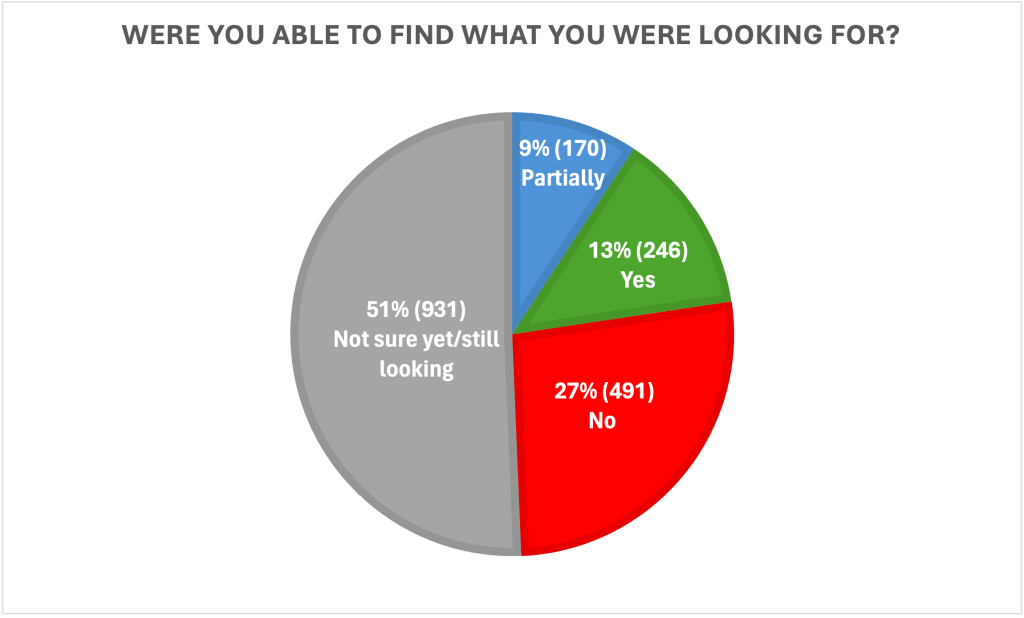
From the agency’s site intercept survey, we learned that only 13% of site visitors reported success at finding what they were looking for. The data revealed that 27% said they could not find what they were looking for. And ~37% were unsure whether they found what they were looking for, either because they found it in part (10%) or were still looking (27%).
There were other signs indicating the site navigation was problematic. Site analytics data showed site users only went to 1-2 pages on each visit to the site. We also created a visual sitemap to demonstrate just how deep the content is buried within the current site structure. Data on the most viewed pages, and cross-referencing the visual site map, led to the research insight that 19 of the top 25 most viewed pages were buried 4-6 clicks away from the top-level navigation. Our hypothesis: the site’s limited number of main categories offers too few paths for reaching the depth of content housed deep within the site.
Establish a usability baseline to benchmark against
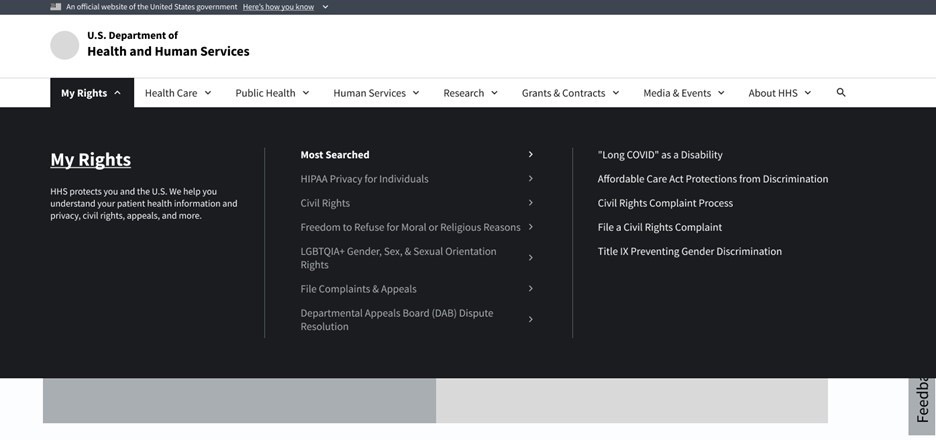
To test our assumptions and establish a usability baseline on the site’s navigation, our User Experience Researcher (UXR) structured a usability study to test the time it takes customers to find their target content using the existing navigation. The study used scenarios as contexts for finding common site tasks. For example, one study task asked customers to file a HIPAA complaint and another asked how they would participate in a clinical trial. The study outcomes indicated huge potential to improve content findability.
Use UX research, information design and content-strategy best practices to generate an improved navigation approach
We made three significant changes to the site’s navigation design:
- Implemented a mega menu navigation structure
We homed in on our site audience groups, and the top tasks that we knew from the site intercept survey. Using the top-task methodology, we reorganized the site’s content according to topic and found the results were a much shallower site structure. Our experience and best-practices knowledge told us the site’s massive breadth of content could be best served-up via a mega menu main navigation design.
Using a mega menu, users can gain a preview of their secondary options and make more informed decisions about where to find their desired content. By surfacing more options – with plain language descriptions – in a secondary “preview” area within the menu, users could remain in the mega menu experience to browse the site. This enhanced ability to browse and see ahead supports increased user confidence and prevents user errors while also allowing for easy error recovery.
Updated menu labels
We applied plain language guidelines to make menu labels more understandable and to remove duplicitous navigation items that caused confusion. We also holistically overhauled the menu labels to focus on the customer tasks rather than internal terminology and program names. For example, “Get Ready for Grants Management” became “How to Apply for a Grant.”Removed extraneous side navigation
With a well-functioning, comprehensive mega menu, the side navigation that came standard on all interior site pages, was rendered redundant. There’s often a misconception that “extra options for navigation” provide a safety net. Instead, they increase user confusion. Duplicative options raise doubts about the authenticity of the content a user has found and can lead to distrust. The duplicative navigation also causes increased confusion for visually impaired customers who use screen-readers to navigate by voice.
Measurable Improvements
We conducted another round of usability testing with the same customers to gather feedback and ultimately validate the proposed solution. Results showed the topic-based megamenu redesign enabled users to reach their target content at least 5x faster than the current site’s main navigation.
Study results showed participants:
- Found how to file a HIPAA complaint in an average of 33 seconds. This was 5x faster than the almost 3 minutes it took the same customers to find the information using the former navigation.
- Located guidance on how to participate in a clinical trial in an average of 57 seconds. This was 7x faster than the almost 7 minutes it took the same customers to find the information using the former navigation.
Other observed benefits included:
- Visual consistency: The mega menu displays the same across the website.
- Easier inter-section navigation
- Increased engagement time on the website
- Repeat visitors and increased reliability and trust: Customers are more likely to return to the website given initial success in finding the information they are looking for.
We can help.
Our CX team at WebFirst has experience designing main navigation systems for leaders in private sector technology, banking, healthcare, and security verticals. We’re familiar with the challenges of broad audiences, industry-specific terminologies, and the temptations to use navigation for content or product promotion over usability. We’re eager to delve into complex problem spaces and design human-centered solutions.